Sometime in 2013, I figured that if I wanted to eventually develop my own web apps, I'd first need to master website development.
The problem is that up to that time, I had been working on backend code 99% of the time - the remaining 1% were for those handful of cases in which I had to debug a web page or perform some web integration work in my day job. So to be clear, I knew how to find my way around an existing web app, but I lacked the skills and the experience to attack a full web development project head-on.
So this is how I ended up studying web development in my spare time. Little did I know that the following months would be pivotal in my software development career.
Learning the basics
In my opinion, books are the best teaching tool out there. So after some careful research, I ended up buying the following ones:
- Head First HTML with CSS & XHTML
- Head First JavaScript
- JavaScript The Definitive Guide1
- CSS The Definitive Guide2
The Head First series was a perfect introduction to creating websites3 - it covered all the basics of HTML, CSS and JavaScript, without assuming any prior knowledge on these things. This was exactly what I needed because I had never been formally introduced to web development.
The Definitive Guide series allowed me to go much deeper and learn the intrinsic details of JavaScript and CSS. I read the 1000+ pages of JavaScript The Definitive Guide and I played with all of its code snippets. Call me OCD or whatever, but my goal was to learn as much as I could about JavaScript the programming language. So I guess that I succeeded in this regard.
However, CSS The Definitive Guide felt much more like a reference book than a guide that I could read from cover to cover. So I skimmed over its contents and only read the sections that interested me. After that, I felt more than ready - and highly motivated - to test out my newly acquired skills.
My first challenge
This was when I learned that my Toastmasters club was looking for a new webmaster to manage its website:
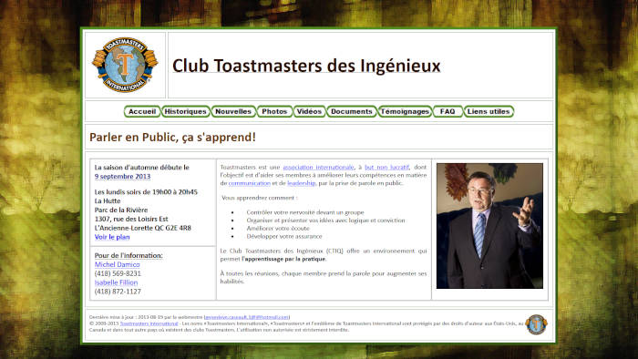
Pretty old school, wasn't it?
Nonetheless, I jumped at the opportunity of updating it once in a while - which I did do for a couple of months. I figured that it would give me some practical webmaster experience.
But after a while, I realized that it wasn't up to par with the other websites of the time:
- It was a real pain to update because it had been built using Microsoft Word - yes, you read this right. So I had to either use Word or edit the pre-generated HTML files manually, which were polluted with garbage HTML tags and inline CSS styles.
- It was esthetically outdated4. And it looked pretty bad on mobile devices.
- There was too much content, thus potentially discouraging our visitors - after all, all they wanted to know was when and where our club meetings occurred5.
- It wasn't selling the Toastmasters experience very well - I couldn't imagine someone becoming intrigued by our club just by visiting our website.
So I came up with a plan to revamp the website and I presented it to my Toastmasters colleagues. Sure enough, they provided me some precious feedback - which I incorporated into my work - but overall they agreed enthusiastically with my plan.
Designing as a non-designer
The only issue was that designing a good-looking website, for somebody with no prior experience, is hard. Much harder than coding the website per se.
I didn't know anything about design standards and usability, but I felt confident that with enough effort and by taking some inspiration from other websites, I could come up with something that looked great. To do that, I used an effective, yet unusual, mockup tool - Microsoft PowerPoint.
This was my very first mockup attempt - yikes!6
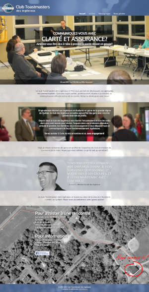
But then I iterated a lot over it and I came up with a more decent version. Here's a montage showing the different screens:
Some of the features that I planned were particularly interesting:
- Everything would fit on a single page (similar to Single-Page Applications or SPAs).
- Clicking the top menu items would bring the visitor to the corresponding section on the page.
- Scrolling to a particular section would highlight the corresponding top menu item.
- The top menu would collapse into a hamburger-style push menu when the screen was resized under some threshold (yep, to support mobile devices!).
- Background pictures would show what our Toastmasters meetings were like.
- There would be a right-hand side "carousel" to display club-related updates and news.
I showed my design to my Toastmasters colleagues one more time to get their final approval, and I started to implement it.
Putting myself to work
Building the website went pretty much like this:
- I built the overall structure and layout using pure HTML5 markup and I focused on the content per se.
- I gradually added CSS styles, fonts and pictures.
- I created the JavaScript code needed to make up for the limitations of CSS7.
It wasn't super complicated per se, but it required a sheer amount of hard work, determination and attention to detail. I'm saying this because as a non-designer, getting things to look like what I had designed "on paper" wasn't obvious. For example:
- Positioning things correctly and cleanly in CSS is tricky because there's an endless number of wrong ways of doing it and not all web browsers render things identically.
- Resizing things to accommodate different screen sizes (desktop VS mobile devices) isn't easy either. While most things can be done in CSS, some others are much easier to do using JavaScript.
- Choosing harmonious colors and fonts is also hard because you need to experiment a lot and have an eye for what looks good and what doesn't. At the same time, I had to respect Toastmasters International's brand guidelines.
- Integrating real-world pictures in a seemless and pleasing way isn't trivial either - a good camera and good editing skills are required. GIMP was my friend here!
- Writing JavaScript code that modifies styles and that gives you the exact visual effects that you have in mind requires a lot of tweaking.
Besides, I realized that several of the things that I had originally envisioned were either not practical, too hard to implement, or simply not pretty. For example, many of the screens that I had previously designed looked amateur or unfinished in the real world. And some of their features, like the right-hand side news carousel, seemed a bit gadgety to me. So I had to improve and remove a couple of things.
Perhaps I could have taken a route that was much easier technically - for example, by using an existing WordPress theme. But then, the end result probably wouldn't have been as close visually to my original design. And more importantly, I wouldn't have learned as much as I did. After all, my goal was to understand how to build things from the ground up.
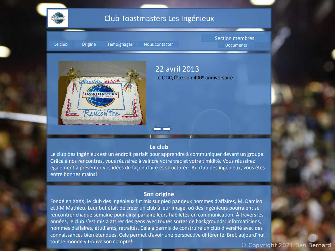
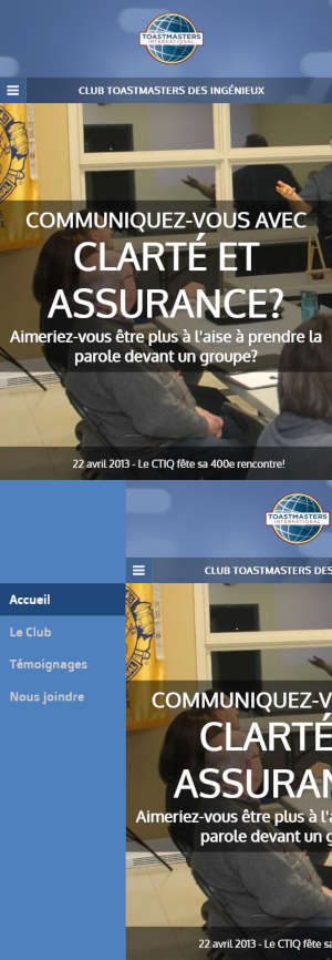
The final result
So all in all, I was pretty happy once I published the final version:
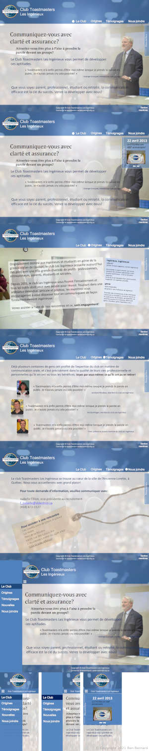
And here's a preview of what it looked like on a mobile device:
But the best reward of all was probably the glowing feedback that I received from my Toastmasters colleagues, including from the then club president.
Closing thoughts
This project was a real "breakthrough" in my software development career - I finally understood web development.
Additionally, it was a very good introductory project, because it was simultaneously high-visibility and low-risk. I'm very thankful for the opportunity that my old Toastmasters club8 gave me.
I learned that building an engaging and good-looking website isn't an easy feat. This is probably why most people use existing platforms and prebuilt themes these days, just like I did for this blog. In 2021, this is the rational and reasonable thing to do (that is, unless you have some serious design skills).
Yet, building things from scratch stays the single best way to understand how things work under the hood. But if I had one piece of advice to give you - just don't do that with a high-visibility, high-risk project though.
Disclaimer: this post contains Amazon affiliate links that will help me pay for the hosting of this blog.
As of 2021, you should buy the 7th edition of JavaScript The Definitive Guide. At the time, I bought the 6th edition, which is still excellent, but it lacks many important topics from the 7th edition. ↩
As of 2021, you should buy the 4th edition of CSS The Definitive Guide. Back in 2013, I bought the 3rd edition, which was excellent at the time, but CSS properties and features have evolved quite a bit since then. ↩
Don't judge these books by their cover - it would be a major mistake. They're absolutely wonderful for beginners. ↩
The website was certainly a good first effort, but it wasn't state-of-the-art anymore. ↩
I learned that when designing a website or a web app, I need to focus on my target audience and their specific needs. In the particular case of my Toastmasters club's original website, it had an identity crisis; it's as if the original author wasn't sure who their audience was. Would the website be mainly used by current members to share documents, or would it be used as a way to convince potential visitors to join us? The goal wasn't clear. ↩
I know, I know. This first iteration looked worse than the website I intended to replace. But I needed to start somewhere, right? ↩
Some elements were easier to make responsive via JavaScript than purely via CSS. ↩
Unfortunately, this particular Toastmasters club shut down sometime in 2018. ↩